
History of the Bitcoin Logo
The Bitcoin logo has gone through a few iterations since it was first created in 2009. The original logo, designed by Satoshi Nakamoto, was a gold coin with the initials "BC" inscribed in the center. This logo was inspired by the physical gold coins that Bitcoin was intended to replace.
In 2010, Nakamoto updated the logo to a more stylized design. This logo featured a single "B" in the center of a golden circle. The new logo was inspired by the dollar sign, and it was intended to give Bitcoin a more professional appearance.
The logo has remained largely unchanged since 2010. However, there have been a few minor tweaks to the design over the years. In 2015, the Bitcoin Foundation released a new version of the logo that was slightly brighter and more vibrant.

The logo is one of the most recognizable symbols in the world. It is a simple yet effective design that perfectly captures the essence of Bitcoin. The logo is a reminder that Bitcoin is a digital currency that is designed to be secure, private, and decentralized.
Here is a more detailed look at the history of the logo:
2009: Satoshi Nakamoto creates the first logo, which is a gold coin with the initials "BC" inscribed in the center.
2010: Nakamoto updates the logo to a more stylized design. This logo features a single "B" in the center of a golden circle.
2015: The Bitcoin Foundation releases a new version of the logo that is slightly brighter and more vibrant.
Present: The logo remains largely unchanged.
The color orange: Orange is a warm and friendly color that is often associated with creativity, success, and change. These are all qualities that are also associated with Bitcoin.
The circle: The circle is a symbol of unity and continuity. It represents the global network of Bitcoin users and the endless possibilities that the cryptocurrency offers.
The “B”: The “B” is stylized with two vertical strokes that extend from the top and bottom of the letter. These strokes represent the two halves of the Bitcoin network: the miners who create new blocks and the users who spend and receive bitcoins.
Together, these elements create a logo that is both simple and powerful. The Bitcoin logo is a reminder of the cryptocurrency's core values and its potential to change the world.
AI is the Neat Handwriting of the Illiterate
A model in the hands of someone who has read the filing and walked the plant is a clerk. The same model, speaking for someone who has done neither, is a disguise. On AI slop, phantom citations and factslop, why finish stopped being evidence of work, and the containment layer KXCO built so a machine cannot speak as the institution until a source is attached.
Worthship: Do Not Conform to the Age
Worthship is the older English word for worship, and it means to ascribe worth. Bishop Robert Barron preached Romans 12 on 30 August. This essay follows the text into the prison letters, and puts two questions to a graph: do the four readings of that Sunday agree, and was Paul free or in chains when he wrote about despair?
The Truth in All Its Ugliness Must Survive
A majority vote does not determine the truth. Consensus is a mood, gossip is a sport, and a model will write the pretty version for free. Why the ugly number has to survive, why a record beats a dashboard, and what KXCO was built to keep standing when the room changes its mind.
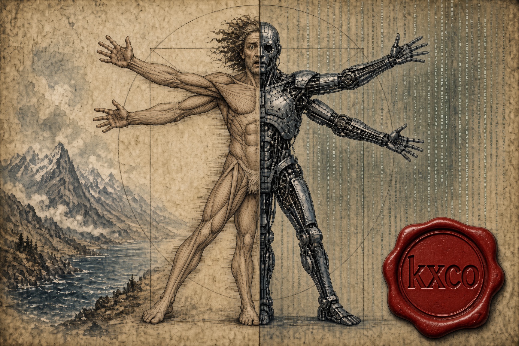
Don't Be the Best, Be the Only: Winning in an AI World
AI is repricing competence downward. What it cannot reproduce is a life. The case for remaining non-fungible, why friction still produces the best ideas, and what it means to build AI systems that keep the human intellect in them.
Every story, signed and delivered.
Subscribe to the kxco channel and get the headline, the AI-written key takeaways, and the chain-anchor link the moment we publish. Audio versions and per-ticker subscriptions arrive in the next iteration.